


Introduction to Mobile UX Design
In the rapidly evolving digital world, Mobile User Experience (Mobile UX) Design has emerged as a cornerstone of successful digital products. It's not just about how an app looks; it's about how it feels, how it responds to user interactions, and how intuitively it leads users through tasks. At its core, mobile UX design is the art and science of making mobile applications not just functional but also enjoyable and accessible.
The importance of mobile UX design in today's landscape cannot be overstated. With the proliferation of smartphones and tablets, more people than ever are accessing the internet on mobile devices. As of 2023, nearly 55% of global internet traffic comes from mobile devices, a clear indicator of the mobile-first world we live in. This shift has massive implications for businesses and developers, who must prioritize mobile UX to meet user expectations and stay competitive.
Understanding user behavior trends is pivotal in mobile UX design. Users expect fast, seamless, and engaging experiences. They demand intuitive navigation, quick load times, and content that's easily consumable on smaller screens. A poor mobile UX can lead to increased bounce rates and lost revenue, while a well-designed mobile experience can enhance customer satisfaction, boost engagement, and drive conversions.
In the following sections, we'll dive deeper into the principles and practices that define excellent mobile UX, offering insights into creating experiences that resonate with users and stand out in the crowded digital marketplace. Stay tuned for an in-depth exploration of how to master the art of mobile UX design.
Core Principles of Mobile UX Design
In the realm of Mobile UX Design, certain core principles stand as pillars for creating effective and user-friendly applications. These principles, while universal in the world of UX, take on unique nuances when applied to mobile interfaces.
Usability: This entails designing apps that are not only easy to use but also intuitive. In a mobile context, usability means ensuring that navigation is straightforward, touch targets are adequately sized, and actions require minimal steps.
Accessibility: Mobile UX must consider users with diverse abilities. This includes implementing voice commands, screen readers compatibility, and ensuring that the app is usable under various lighting conditions. Accessibility in mobile also means designing for varying screen sizes and ensuring that all features are accessible with one-handed use.
Engagement: Engagement in mobile UX revolves around creating an experience that keeps users returning. This involves using interactive elements, personalized content, and smooth transitions to create a captivating user journey.
Responsiveness: Mobile devices come in various sizes and orientations. A core principle of mobile UX is ensuring that your app provides a consistent experience across all devices, whether it’s a small smartphone or a large tablet.
Efficiency: In the mobile world, efficiency means quick load times, minimizing data usage, and optimizing battery life. It also involves designing workflows that reduce the cognitive load on users, allowing them to complete tasks with ease and speed.
Consistency: Consistency in design, navigation, and branding across platforms enhances user familiarity and trust. It’s crucial in mobile UX to maintain this consistency while also adapting to the unique features of mobile devices.
Each of these principles plays a critical role in defining the mobile experience. By understanding and applying these principles effectively, designers can create mobile applications that are not just functional, but also enjoyable and inclusive, catering to the wide range of user needs and expectations in the mobile environment.
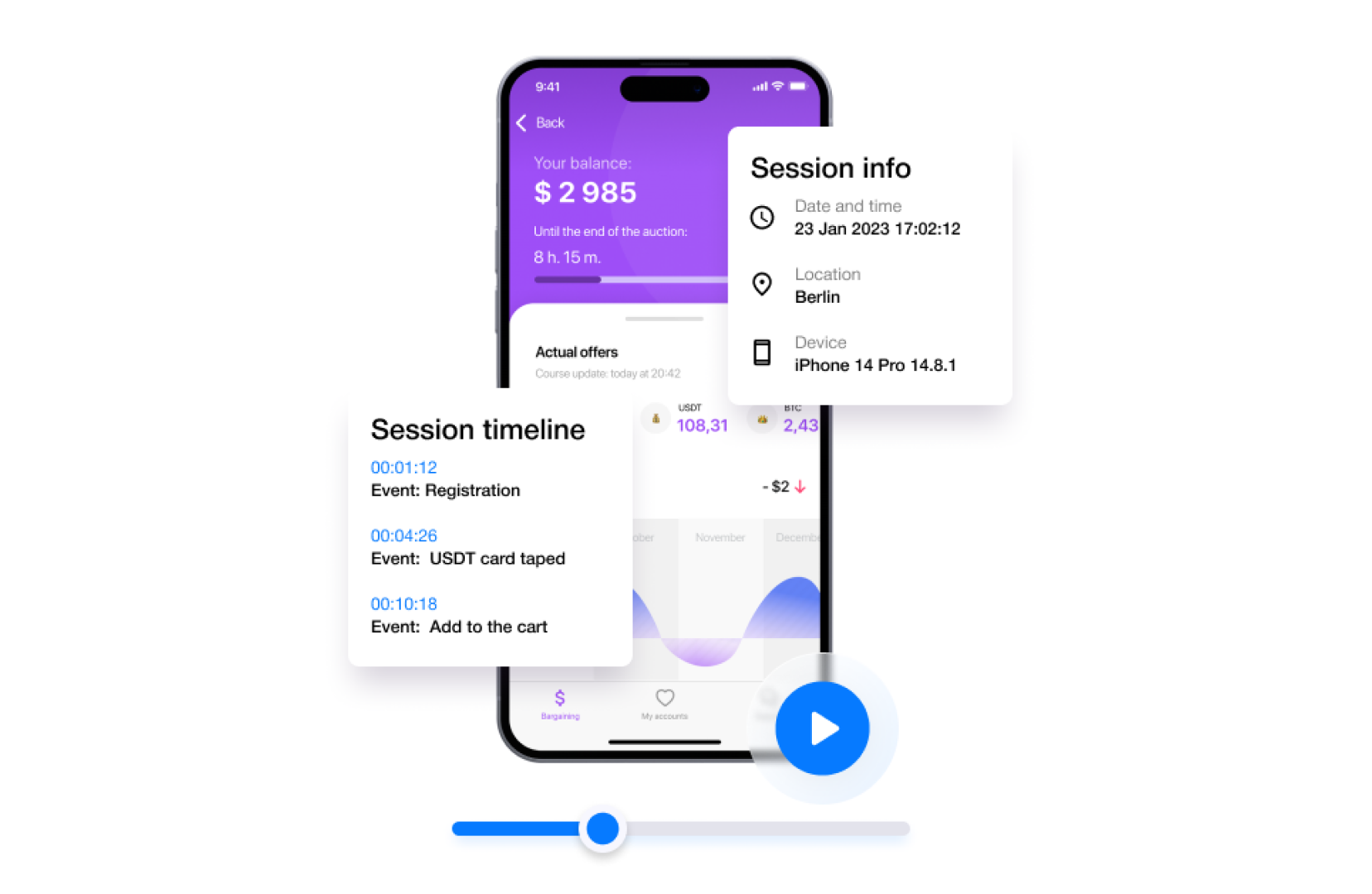
UserX helps identify issues users face with the app, like difficulties in completing a purchase. Features like session recordings and touch heatmaps reveal why users fail to complete conversions, allowing for targeted improvements in UX design
Analyzing User Behavior and Preferences
Recent research into user interactions with mobile devices reveals enlightening trends and preferences. Primarily, users tend to prefer simplicity and speed. A cluttered interface or a slow app is often a major turn-off. Studies show that most mobile interactions are brief, suggesting that users favor apps that allow them to accomplish tasks quickly and effortlessly.
Another critical insight is the increasing preference for one-handed use. With the growing size of smartphones, app interfaces that facilitate easy navigation and interaction within thumb’s reach are highly favored.
In-depth analysis of user behavior and preferences in mobile UX reveals several key insights:
Brief and Goal-Oriented Interactions: Research indicates that mobile device users prefer quick and goal-oriented interactions. Apps that enable users to achieve their objectives swiftly are more likely to be favored.
One-Handed Use: With the increasing size of mobile devices, there's a growing trend towards designs that support one-handed operation. Users value interfaces that are easily navigable with a single thumb.
Frustrations and Pain Points: Common frustrations include complex navigation, small clickable areas that lead to errors, slow loading times, and intrusive advertisements. Users frequently express dissatisfaction with apps that require excessive steps to complete simple tasks.
Desire for Personalized Experiences: There's a noticeable preference for personalized mobile experiences. Users appreciate apps that adapt to their individual usage patterns, offering tailored content and functionality.
Security and Privacy Concerns: Users are increasingly concerned about their data security and privacy. Apps that transparently handle user data and provide robust security measures are more trusted and preferred.
Understanding these user behaviors and preferences is crucial for developing mobile UX designs that are not only functional but also align with user expectations and needs.
Observing user interactions through session recordings helps understand user behavior and expectations. UserX selectively displays relevant recordings, assisting in identifying and refining UX elements that are effective or need improvement
Common user frustrations in mobile UX include overly complicated navigation, small touch targets leading to frequent errors, slow load times, and intrusive ads or notifications. Users also express a desire for personalized experiences, reflecting a trend towards apps that adapt to individual usage patterns and preferences.
In summary, understanding these behaviors and preferences is crucial for designing mobile experiences that are not only user-friendly but also align with the evolving expectations and needs of a diverse user base.
Designing for Different Screen Sizes and Orientations
In the mobile ecosystem, designing for various screen sizes and orientations presents unique challenges. The diversity of devices—ranging from small smartphones to large tablets—requires a flexible design approach.
Responsive Design: This strategy involves creating a single layout that dynamically adjusts to fit different screen sizes. Effective responsive design ensures usability and visual appeal across devices.
Adaptive Design: Unlike responsive design, adaptive design uses distinct layouts for different screen sizes. This approach can provide more tailored experiences but requires more development work.
Case Studies:
Twitter: An example of successful responsive design. Twitter's mobile interface adjusts gracefully across devices, maintaining functionality and user experience.
Amazon: Demonstrating adaptive design, Amazon provides customized experiences for mobile and tablet users, optimizing navigation and display according to the device.
Both approaches have their advantages and must be chosen based on the app’s target audience and core functionalities. The goal is always to provide a seamless user experience, regardless of the device used.
Navigation and Input Methods in Mobile UX
The evolution of mobile UX has brought forward diverse navigation and input methods, enhancing user experience significantly.
Touch-Based Navigation: The most common form in mobile devices, touch navigation, includes tapping, swiping, and pinching. Key best practices involve ensuring that touch targets are adequately sized and spaced to prevent accidental presses, and designing for the thumb's natural movement arc for one-handed use.
Voice Navigation: With the rise of virtual assistants like Siri and Google Assistant, voice navigation is increasingly popular. Best practices include designing clear voice commands and providing visual feedback to confirm user requests.
Gesture-Based Navigation: Gestures like swiping and dragging offer a more intuitive and engaging way to interact with apps. Best practices include using common gestures that users are already familiar with and providing onboarding tutorials for more complex gestures.
Understanding the customer journey is crucial for mobile UX design. UserX provides insights into how users navigate and interact with an app, which can inform design decisions to enhance user experience.
Overall, the choice of navigation and input methods should align with the app's context, content, and user needs, ensuring an intuitive and efficient user experience.
Visual Design and Aesthetics in Mobile UX
Visual design plays a pivotal role in mobile UX, significantly influencing user perception and engagement. It encompasses the use of color, typography, imagery, and overall layout to create an aesthetically pleasing and functional interface.
Trends in Visual Design:
Minimalism: Streamlined interfaces with a focus on essential elements, using negative space to draw attention to key features.
Bold Color Schemes: Vibrant and contrasting colors to create visual interest and guide user attention.
Custom Illustrations and Animations: Personalized graphics and subtle animations to enhance the user experience and make interfaces more dynamic.
Examples of effective visual design can be seen in apps like Instagram, which uses a clean layout and intuitive iconography, and Spotify, which employs bold colors and personalized artwork to enhance user engagement. These designs not only make the apps visually appealing but also improve their usability and user satisfaction.
Mobile UX and Accessibility
Inclusive design in mobile UX is essential to ensure that digital products are usable by as many people as possible, including those with disabilities. This focus on accessibility is not just a moral imperative but also expands market reach and enhances the overall user experience.
Techniques for Accessibility:
Screen Reader Compatibility: Ensure that the app is navigable and readable by screen readers.
Color and Contrast: Use high contrast color schemes for readability, and avoid color-coding as the only means of conveying information.
Touchable Targets: Make touch targets large enough to be easily tapped by users with motor impairments.
Captioning and Subtitles: Include these for multimedia content to assist users with hearing impairments.
Heatmaps provide visual data on user interactions, while conversion funnel analysis helps identify where users drop off. This information is vital for pinpointing UX issues and improving app design to enhance user retention and conversion rates
By incorporating these techniques, mobile apps can become more accessible, providing a better experience for all users, regardless of their abilities or limitations.
Optimizing Mobile Performance and Load Times
Optimizing mobile performance is crucial for user retention and satisfaction. Here are some technical considerations and tips:
Optimize Images and Media: Use compressed image formats and appropriate resolutions to reduce load times without sacrificing quality.
Minimize Use of Heavy Animations: While animations can enhance UX, they can also slow down performance. Use them judiciously.
Efficient Coding and Frameworks: Opt for lean and efficient coding practices. Utilize modern frameworks optimized for mobile performance.
Server-Side Optimizations: Implement techniques like caching and content delivery networks (CDNs) to speed up content delivery.
Regular Performance Testing: Continuously test and monitor the app’s performance across different devices and networks to identify and address issues promptly.
By providing session recordings of app crashes, UserX enables quick identification and resolution of technical errors, which is essential for maintaining a smooth user experience
These strategies can significantly improve the speed and smoothness of a mobile app, leading to a better overall user experience.
Personalization and User Engagement
Creating personalized experiences in mobile UX is key to enhancing user engagement and retention. Here are some strategies and methods:
Leverage User Data: Use data analytics to understand user preferences and behaviors, then tailor content and recommendations accordingly.
Customizable Interfaces: Allow users to customize aspects of the app to suit their preferences, enhancing their sense of control and connection.
Push Notifications: Use targeted and timely notifications to re-engage users, but be mindful of their frequency to avoid annoyance.
Engaging Onboarding Experience: Craft an onboarding process that is informative yet engaging, helping users understand the app’s value proposition.
Regular Updates and Feedback Loops: Continuously update the app with new features based on user feedback, keeping the experience fresh and relevant.
These strategies can significantly boost engagement by making users feel that the app is tailored to their individual needs and preferences.
Security and Privacy Considerations in Mobile UX
Ensuring user data protection is paramount in mobile UX design. Here are best practices:
Data Encryption: Use strong encryption for data storage and transmission.
Minimal Data Collection: Collect only the data essential for the app’s functionality.
Transparent Privacy Policies: Clearly communicate how user data is used and stored.
Secure Authentication: Implement robust authentication methods, like two-factor authentication.
Regular Security Audits: Conduct regular audits to identify and rectify vulnerabilities.
Balancing UX with security involves making security measures as seamless and non-intrusive as possible, without compromising the app’s usability.
Conclusion
In conclusion, mobile UX design is an ever-evolving field that hinges on understanding user behavior, preferences, and technological advancements. Key takeaways include the importance of usability, accessibility, engagement, responsive and adaptive designs, intuitive navigation, and aesthetic visual elements. Additionally, optimizing performance, personalizing experiences, and ensuring security and privacy are crucial. The field demands continual learning and adaptation to new trends, technologies, and user expectations. By staying informed and adaptable, designers can create mobile experiences that not only meet but exceed user needs, ensuring both satisfaction and success in the digital marketplace.
